- Templates
- Additional resources
-
Digital design system
External link -
PatternFly
External link -
Work Your Way
External link
Product branding handbook
As a brand, our goal is to develop software that helps customers build for the innovation they need today and in the future. By creating a consistent customer journey that is transparent about our offerings, we help our current and future customers understand our portfolio and what it can do for them.
Product branding helps us to achieve this by clarifying the differences between Red Hat® products and components, as well as the differences between offerings that are unique to Red Hat versus community projects or partner solutions. The more consistent and clear we are about product branding, the more recognition and trust we build for our offerings and for the Red Hat brand.
This handbook breaks down the various elements we use to create a product’s brand and how to use them.
What is product branding?
When we say product branding, we’re talking about all the different elements that come together to represent a specific Red Hat offering. This includes written elements—like the product name, approved acronyms, and messaging—and visual elements—like logos and icons. Depending on how we market a product, it could even include artwork, audio, animations, and more.
The goal is to help customers recognize our offerings no matter where in the customer journey they see them. This means we need recognizable, repeatable elements that we use consistently over time. Product branding is also an opportunity to celebrate our offerings and the teams who build them through swag, office graphics, and more.
Common elements of product branding
Name
When we name things, we always prioritize building the Red Hat brand first. We don’t create made-up names or use metaphors or jargon; we want our names to clearly explain what the offering does. New names should always be approved by the Naming and Legal teams before use.
It’s important that we use the names of our offerings consistently, with correct capitalization and following any abbreviation or acronym guidance.

All of these elements use our existing brand and design language to create a distinct identity for an offering. It’s the best of both worlds: our offerings stand out from each other while still feeling distinctly like Red Hat. Which combination of elements an offering should use depends on what kind of offering it is.
Logo
Product logos all use the same template, with the Red Hat logo followed by the full product name. This helps our product portfolio look unified and means we can add new offerings to the portfolio without additional design and legal costs.
Product logos generate instant recognition for our parent brand and make it clear to our customers which Red Hat offerings are available for purchase.

Icon
When we need to quickly represent an offering in a small space, we use a technology icon. They’re built using the Red Hat icon style and our core colors, and represent the functionality of the offering at a glance.
Technology icons help customers to instantly recognize Red Hat offerings they’re familiar with in places like digital marketplaces, interfaces, and diagrams, and help to differentiate Red Hat offerings from one another.

Offering types: Platform sub-brands, products, and components
When we’re branding our offerings, it helps to understand how they fit into the bigger picture of our product portfolio. We categorize offerings based on what they do, how our customers access them, and our marketing priorities. Most of our products sit within one of our 4 platform sub-brands, and are powered by components like features, plug-ins, and operators.
We brand each of these types of offerings differently because they show up at different parts of the customer’s journey. Creating brand elements also takes significant investment in time, resources, and budget, so we want to be sure to invest wisely.
Platform sub-brand details
Platform sub-brand details
We have 4 platform sub-brands: Red Hat Enterprise Linux, Red Hat OpenShift, Red Hat Ansible Automation Platform, and Red Hat AI. Each has their own identity with the Red Hat brand portfolio.

In addition to product logos and technology icons, our platform sub-brands have specific artwork as part of the hybrid style that reflects the unique value they provide to our customers, but still look distinctly like Red Hat.
Use correct naming and capitalization.
Platform sub-brand names always start with “Red Hat” and are typed in title case. Always use the full name on the first use, and only use approved abbreviations or acronyms when necessary. Reference the official product list to be sure you're using the correct name.


Use the correct technology icon.
Technology icons for platforms have a black rounded rectangle. In one-color applications, the icon becomes filled. Don’t change the colors of the icon or remove it from the rounded rectangle; the rounded rectangle is an important part of the icon.
Use the platform sub-brand's logo.
Platform sub-brands use a logo that includes the Red Hat logo and the full platform sub-brand name. Use existing platform sub-brand logo images rather than recreating or altering logos.
Use approved sub-brand platform artwork.
Sub-brand platforms use custom artwork built from their technology icon. Use approved platform sub-brand artwork in our core colors to tie it back to our parent brand.


Product details
Product details
Products are the software and services that we sell. All of our products’ names start with Red Hat followed by a description of what the product does. Many of our products are marketed or bundled as part of one of our platforms.
We use product logos and technology icons to distinguish our products from each other and from our competitors. Products don’t have their own custom artwork. Instead, use general Red Hat imagery or the artwork of a related platform (for example, OpenShift platform artwork for OpenShift AI marketing).
Use correct naming and capitalization.
Product names always start with “Red Hat” and are typed in title case. Always use the full name on the first use, and only use approved abbreviations or acronyms when necessary. Reference the official product list to be sure you're using the correct name.


Use the correct technology icon.
Like platform sub-brands, technology icons for products have a black rounded rectangle. In one-color applications, the icon becomes filled. Don’t change the colors of the icon or remove it from the rounded rectangle; the rounded rectangle is an important part of the icon.
Use the product’s logo.
Like platform sub-brands, products use a logo that includes the Red Hat logo and the full product name. Use existing product logo images rather than recreating or altering logos.
Don’t use or create custom artwork.
Products don’t use custom artwork. When you need more than just logos and icons, use the hybrid style artwork of a related platform (for example, use OpenShift platform artwork for Red Hat Advanced Cluster Security for Kubernetes).
Component details
Component details
Components are features, plug-ins, operators, builds, and other technologies that are part of or used alongside our products and platforms. Components might be a feature of a single product, or they might be available across multiple products.
We focus our marketing efforts on our platforms and products, so components don’t need as many branding elements. They’re named, but we usually don’t put “Red Hat” in front or use title case when we type the name out. Components don’t have logos, but can have an icon if needed for marketplaces or interfaces.
Use correct naming and capitlization.
When you refer to a component in writing, capitalize and stylize the name correctly. The names of features, plug-ins, and operators use sentence case and usually don’t include “Red Hat.” The name of a build always starts with "Red Hat build of..." to be clear about the origin of the build.
Reference the official product list to be sure you're using the correct name and capitalization.


Use the correct technology icon.
Technology icons for components have a white rounded rectangle. In one-color applications, the icon becomes outlined. Don’t change the colors of the icon or remove it from the rounded rectangle; the rounded rectangle is an important part of the icon.
Don’t use or create a logo.
To make it clear that components are not individually purchasable offerings, they do not use a logo or lockup of any kind. If your project needs to include a logo, use the Red Hat logo or the logo of the product/platform the component falls under, when applicable.
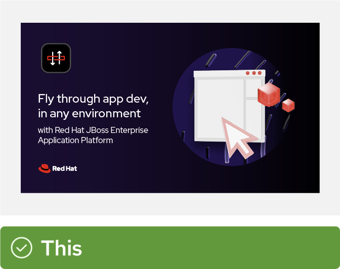
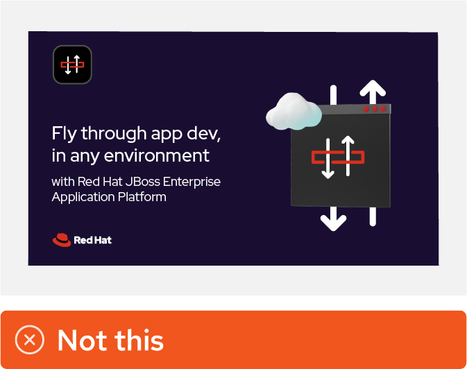
Use hybrid style collages.
Combine hybrid style elements in collages to communicate the value of our technologies. Don't create 3D versions of product icons.
Non-Red Hat offerings
It’s important to be clear about which offerings are unique to Red Hat versus which are community projects, partner products, or general software concepts. We don’t want to overstep our role in the community, and we don’t want to mislead our customers and erode their trust in Red Hat. When we’re referring to these offerings or listing them on marketplaces, it’s best to be as careful and transparent as possible.

Open source community projects
Ask the community for permission to use their name, logo, or icon first. Always use their assets as provided and follow their brand guidelines. Never use or create a “Red Hat version” of their logo or icon.
If the community does not give us permission to use their assets, explore alternatives to represent the community like typing out their name or using a standard icon.

Partners
Use the name, logo, or icon of the partner. Don’t imply that Red Hat owns or created someone else’s product or solution.
Make sure you have permission to use the partner’s assets and follow their brand guidelines. Refer to the partner handbook for more info on how we appear with partners.
3rd party plugins, operators, or models
If we’re including a technology (like a plugin, operator, or AI model) that is supplied by or works with a third party and we don’t have permission to use their logo or icon, we can use the generic technology icon for that kind of offering.

Industry-standard concepts
If you’re referring to a more general, industry-standard technology concept that’s not unique to Red Hat, you should use an icon from the Red Hat standard icon library. Refer to the concept using a commonly understood name that doesn’t imply a unique Red Hat offering.

Represent open source community projects and partner products using their own name, logo, and other branding—with permission.
Don’t recreate the logo or other branding of an open source community or a partner in Red Hat’s style. Don’t create a name that implies that it belongs to Red Hat, either.

Represent Red Hat offerings with their technology icons. Represent general concepts with a standard icon and industry-standard name of the concept.
Don’t remove technology icons from their rounded rectangle or place standard icons inside of a rounded rectangle to make icons match. It’s okay to combine multiple types of Red Hat icons in the same layout.
Applying product branding
Red Hat offerings appear across digital and print mediums, from product interfaces to event spaces to videos and more. Consistent branding across all applications builds recognition for our offerings and the Red Hat brand.
Product branding in marketplaces and catalogs
When our customers are searching for new software, they often turn to marketplaces and catalogs from Red Hat and our partners. With so many offerings available, it’s important for our listings to be clearly and accurately identified as Red Hat offerings so that customers can find them quickly and easily.
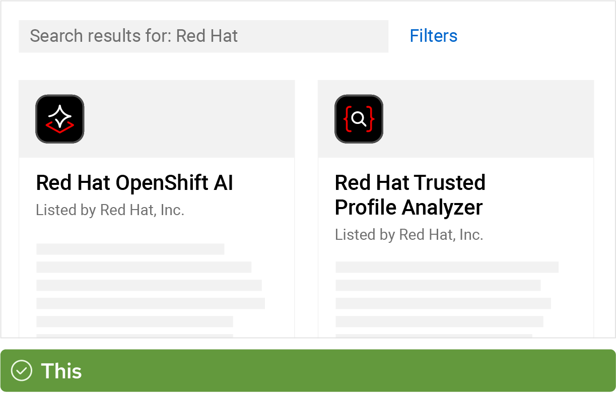
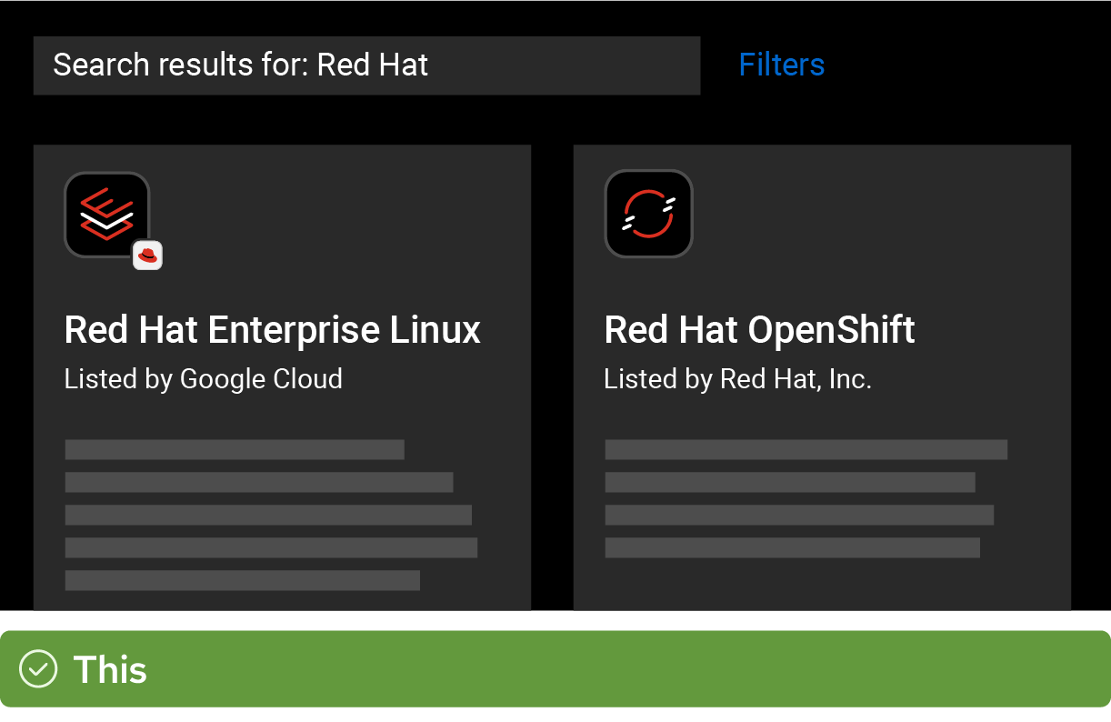
When listings have an image, use the offering’s full color technology icon so that customers can distinguish between multiple Red Hat offerings on the same page.

Use the full, approved name for offerings. For products and platforms, that means including “Red Hat” and typing in title case. For components, pay attention to the official spelling and capitalization of the name.

Listing descriptions should put the information that’s most useful to the customer first. Refer to the product’s messaging guide and keep the description clear and concise.

Partners or resellers who are listing Red Hat offerings with permission should use their own logo for the listing image. Learn more on the partner handbook.

First-party listings of Red Hat offerings in partner’s marketplaces should use Red Hat technology icons for the thumbnail, even when Red Hat is not listed as the provider or source of the software. Learn more about first-party listings in the partner handbook.
If there’s a concern that customers won’t recognize third-party marketplace listings without the Red Hat logo, you can use a badged version of the technology icon.

In Red Hat-owned marketplaces, use technology icons to indicate that listings are compatible with specific Red Hat offerings.

When a listing is for a plugin or operator for an existing Red Hat offering, use a badged version of the technology icon for clarity.

Don’t use the Red Hat logo, product logos, or the hat as the icon for listings. This makes it difficult to distinguish between Red Hat offerings.

Don’t abbreviate names or use a name other than the full, approved name of an offering.

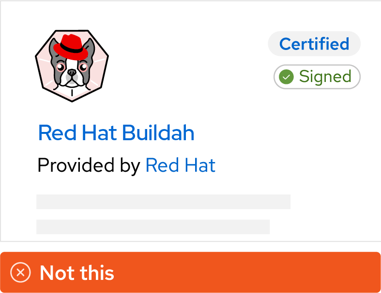
Don’t use the logo or icon of an open source community project or an outdated product icon.
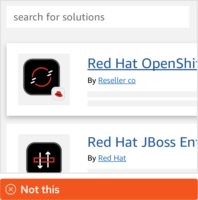
Don’t use a Red Hat logo, technology icon, or hat icon badge when a partner is reselling our products in a marketplace.

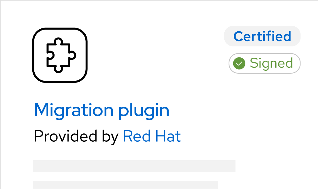
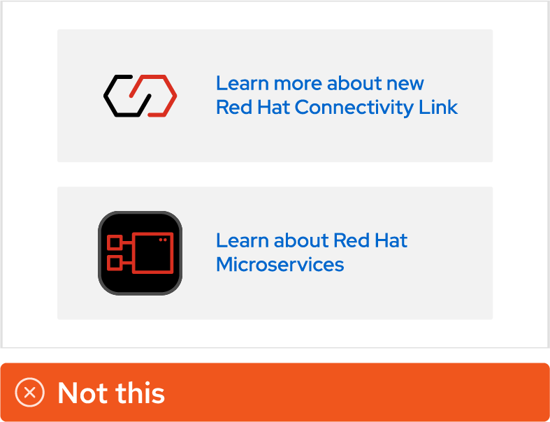
Don’t create new icons to represent plugins or operators for existing offerings.

Don’t use badged icons outside of marketplaces.
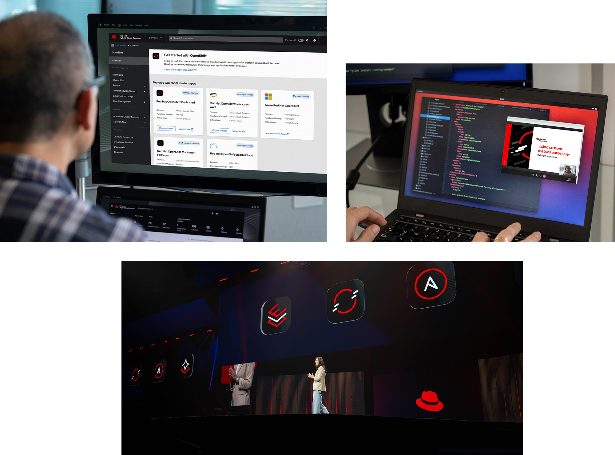
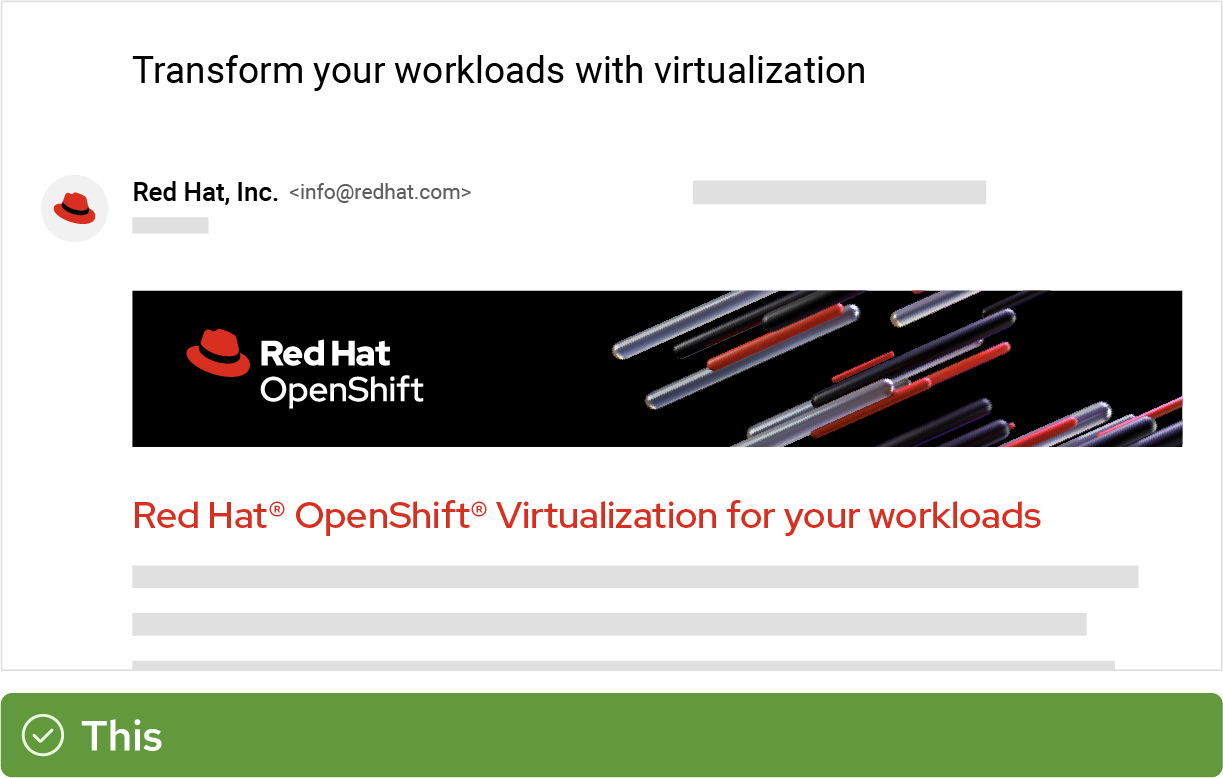
Product branding in interfaces
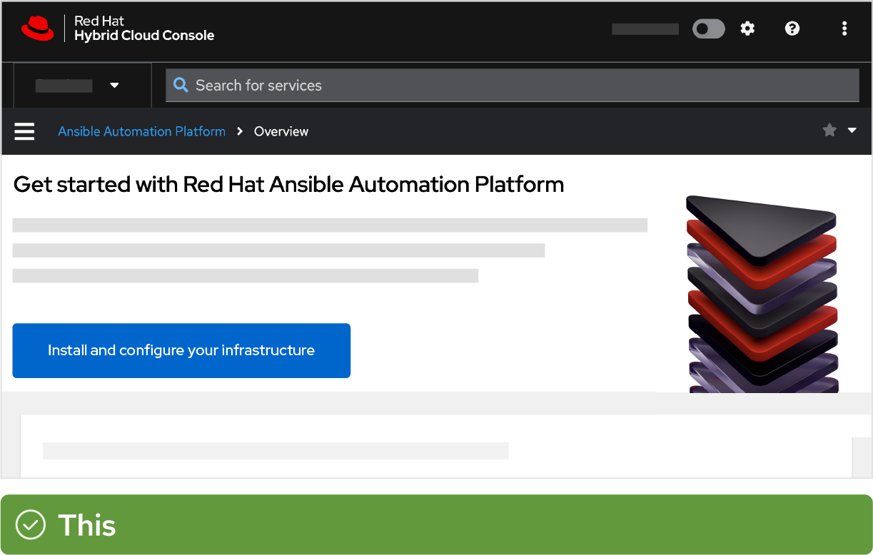
The interface is the actual product itself, where our customers do their work. For many customers, this is the most common way they interact with our brand. Product branding in the interface should improve the user experience (not get in the way), and should clearly communicate which Red Hat offerings they are using.

Use the one- or two-line, full color product or platform logo in the masthead of the interface, with appropriate clear space (at least the height of the “e” in the word “Red”). Always use the approved logo image file rather than recreating the logo.
Use platform sub-brand artwork, hybrid style collages, or illustrations for decoration on hero graphics and empty states
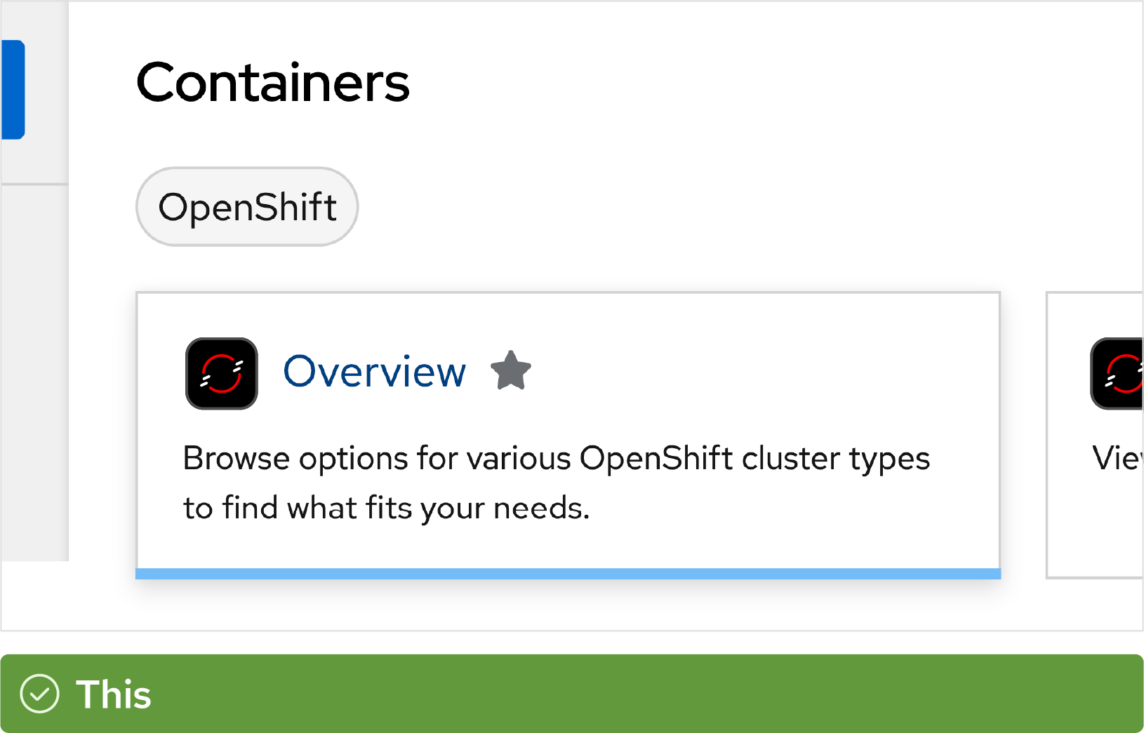
Use technology icons to help users navigate the interface and differentiate between Red Hat offerings.

In interfaces that are built with other design systems (like Material or Carbon), you should still use Red Hat technology icons as they exist to represent our offerings. Use the one-color version of icons when necessary.

In PatternFly, component interfaces that aren’t tied to a specific product or platform sub-brand should use the Red Hat logo in the masthead and type the name of the component in the sidebar.

In component interfaces without a sidebar, type the name of the component in Red Hat Display Medium in the masthead. Place the Red Hat logo in a separate but prominent spot in the interface, like the opposite side of the masthead.

Avoid using one-color logos. In digital applications, we should use full color logos.

Don’t use a three-line product logo in a masthead; there’s not enough room. Opt for a one- or two-line logo instead, which you can request from the Brand team if needed.

Don’t create logos for components. Don’t combine text with the hat or a technology icon.
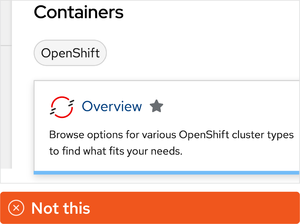
Don’t modify technology icons by changing their color or removing them from the rounded rectangle bounding shape.

Don’t redraw Red Hat icons in the style of another design system. Don’t represent a Red Hat offering with an icon from another design system, either.

Avoid using artwork or graphics for heroes and empty states that don’t match the Red Hat design language.
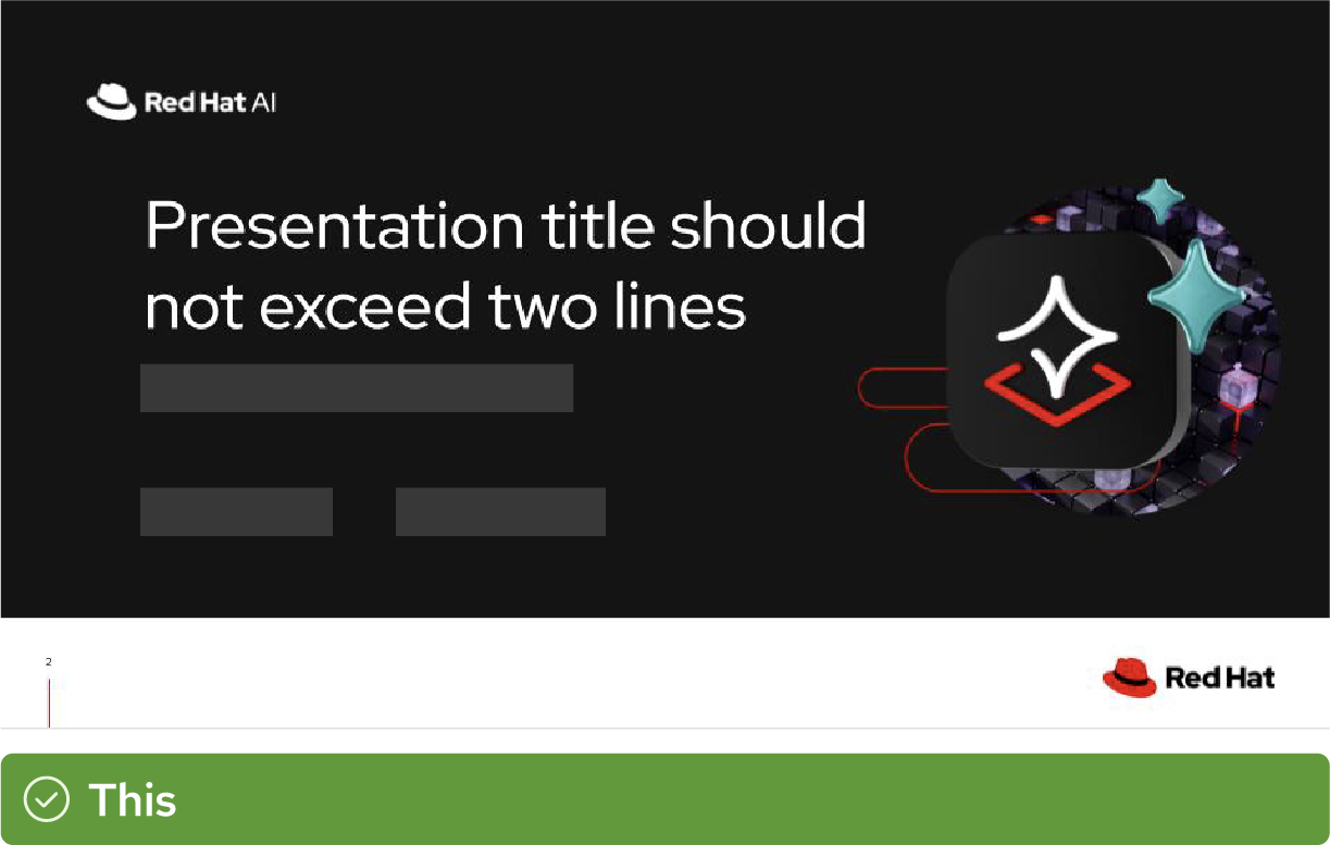
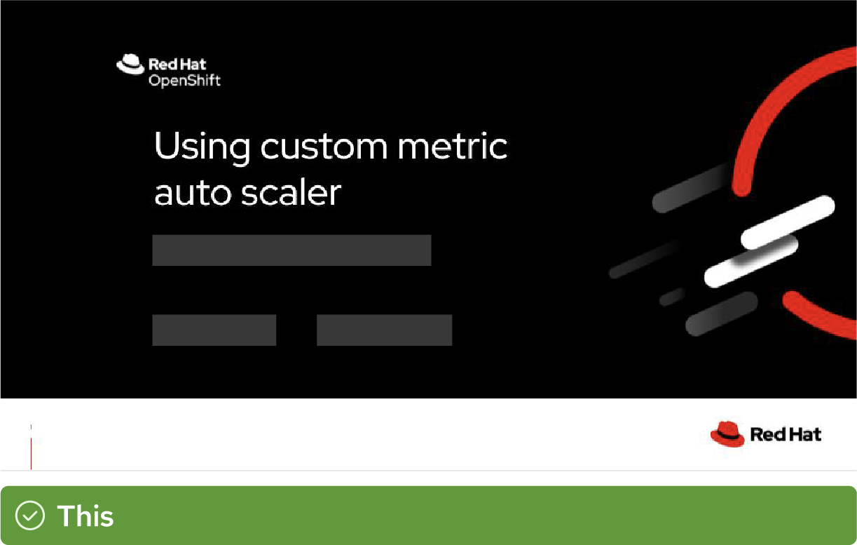
Product branding in presentations
Presentations at Red Hat events, webinars, and sales meetings are often the first place prospective customers and partners see our product branding. It’s important to make the most of those first impressions. And remember—nothing is internal only: Design your slides with the expectation that they might be seen by customers and partners in the future.

Use the full name of an offering on the first use. Approved acronyms and abbreviations come in handy, but they can be confusing without context.

Build recognition for our icons and simplify graphics by using technology icons. You can type the name of the offering near the icon for added context.

Set viewer expectations by using the correct type of icons. Represent Red Hat offerings with technology icons. Represent general concepts with icons from the standard icon library. It’s okay to mix types of icons on the same slide.

When listing multiple Red Hat products on the same slide, type out the names in plain text or use technology icons rather than using multiple product logos.
For presentations related to a platform sub-brand, use one of our platform sub-brand presentation templates. They have platform sub-brand artwork built in.
When referring to a component, use either the general Red Hat presentation template or the template for the platform sub-brand that the component falls under.

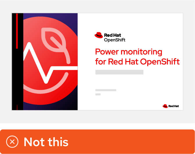
Avoid a “sea of red hats.” Don’t fill a slide with multiple product logos. Use technology icons or type out the names in our font instead.

Don’t use outdated product logos or icons. Check to make sure that you’re using the most recent version of our brand assets.

Don’t create logos for components or pair them with the Red Hat logo in a way that looks like an official logo. Use the component’s technology icon instead.

Don’t use abbreviations on the first reference to an offering. Use approved acronyms or abbreviations only after introducing the full name.

Don’t modify icons or imply that a general concept is an official Red Hat offering. It’s okay to mix multiple icon types on the same slide.
Don’t use technology icons to create custom artwork for a component or product. Only our 4 platform sub-brands use custom artwork.
Product branding in marketing materials
Marketing spans a huge variety of mediums—from our website to advertising, from swag to giant event booths. Using product branding across these applications creates a consistent journey for our customers as they learn more about Red Hat and our offerings, which makes it easier for them to trust what they see when they’re buying and making purchasing decisions. We want to make every brand impression count.

Use product logos on collateral when it’s relevant to the content.

In web graphics, use technology icons and platform sub-brand artwork to visually tie the web experience back to other parts of the customer journey.
When marketing a component, use branding and artwork for the product that the component is a part of. This makes it clear which of our products the customer should purchase to use the component.
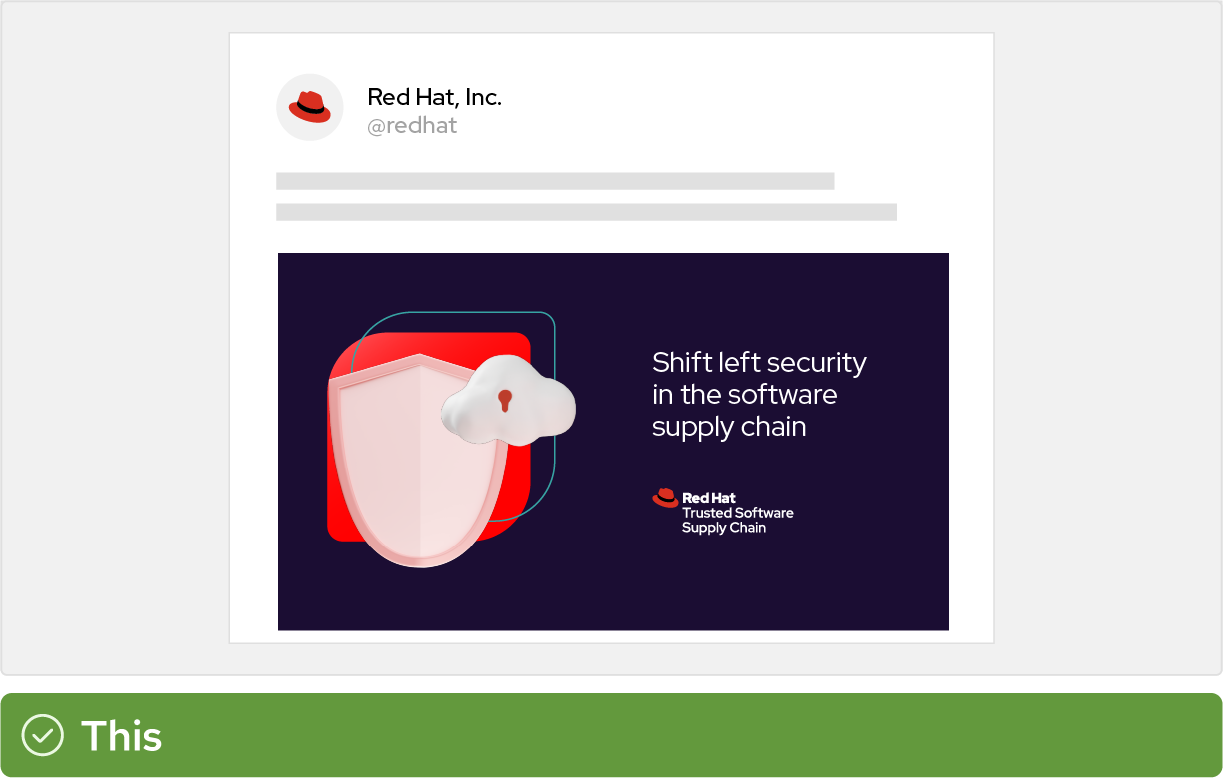
When you need additional visuals, choose general illustrations, icon patterns, or photography related to the concept.

Always include either a product logo or the Red Hat logo on swag. Place the logo in a separate imprint area from the main artwork if needed.

In videos, use approved intros and outros. For our 4 platform sub-brands, these include animated technology icons in combination with the platform sub-brand's logo.

Avoid using multiple product logos on one piece of swag. Instead, use the Red Hat logo and then type out the names of the products.
Don’t abbreviate or simplify names in marketing materials. It might be the first time the customer is hearing about the offering.

Don’t create marketing materials without a Red Hat logo or product logo. Icons and artwork might not be recognizable on their own.

Don’t modify technology icons to create custom artwork for products or components. Use existing illustrations, icons, and photography.

Don’t co-brand a product logo with a partner logo. For co-branded product marketing, use a standard co-brand logo.

Don't remove the background or outline from product icons. Always use the entire icon together.