- Templates
- Additional resources
-
Digital design system
External link -
PatternFly
External link -
Work Your Way
External link
Hybrid style handbook
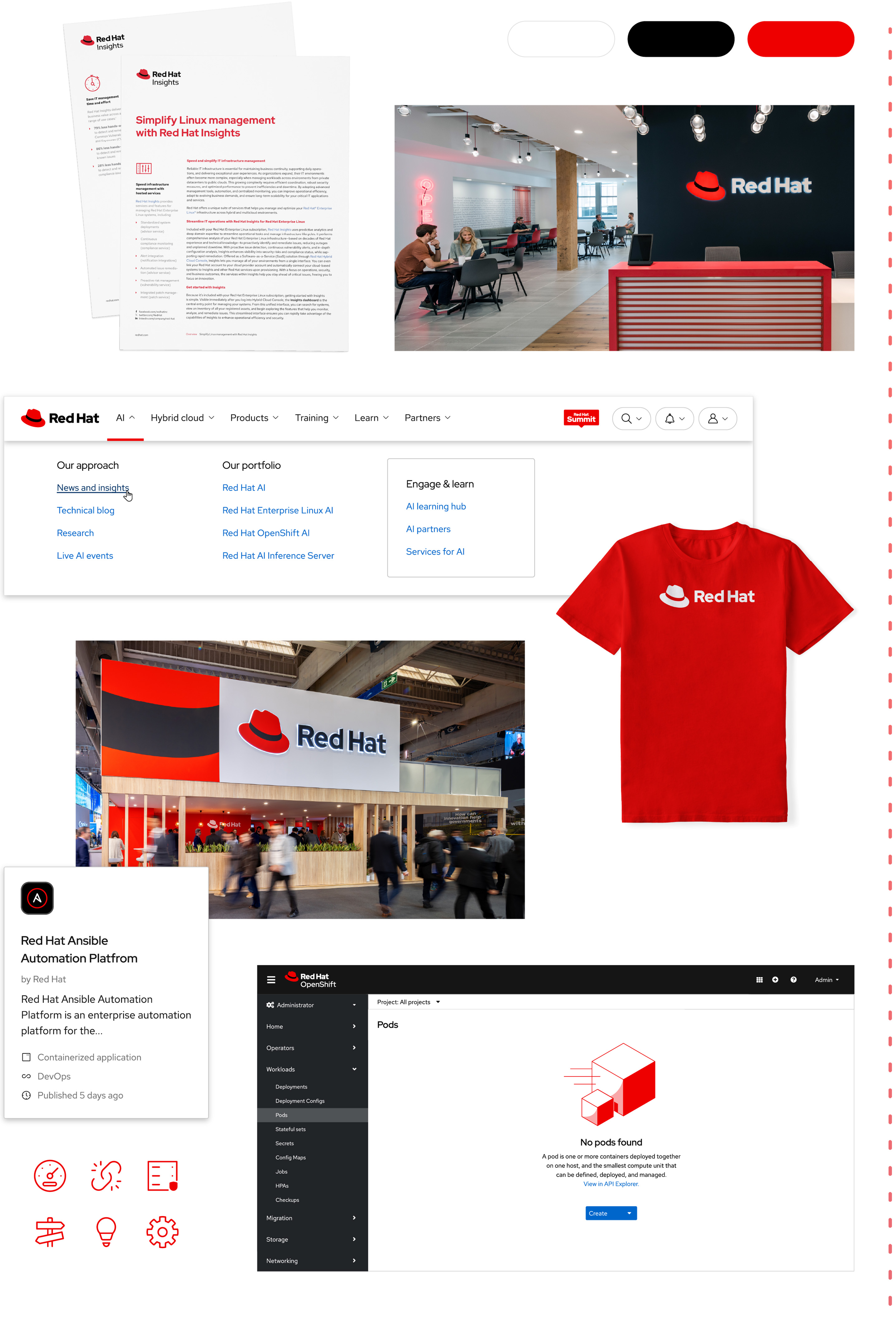
The ideas and innovations of software aren’t something we can capture in a single photo. Hybrid style brings visual concepts together to show the power of software and the people behind it—illustrating how in an open ecosystem, no one innovates alone.
Extending hybrid to design
IT professionals face evolving challenges as their businesses adapt to change. Red Hat’s approach to hybrid cloud builds on a consistent foundation so they can stay flexible as they choose solutions for their needs. To tell stories about how Red Hat® helps customers tackle these challenges, we need the flexibility to create engaging visuals that adapt to new messages and technologies while consistently looking and feeling like Red Hat.
Hybrid style is a system of visual elements—including people, shapes, and tech concepts—built on the foundation of our brand platform and personality. These elements and the ways we combine them represent inclusivity, flexibility, and a forward-thinking approach where open hybrid cloud drives rapid innovation.

Using hybrid style
Hybrid style allows us to add expressive storytelling to our brand, but the essentials of our brand stay the same. Knowing when to and how to balance the two is key.
Consider the goal of each project, the message we want to communicate, and where our customer is in their journey. Each piece of every project falls on a spectrum from the most essential to the most expressive, playful storytelling.
Essential
When the goal is to provide information and build brand awareness, it’s best to stick with the essentials. Focus on our logos, core colors, icons, and typography to create open, intentional designs that are unmistakably Red Hat.
As the goal becomes a mix of building brand awareness and storytelling, introduce playful hybrid style elements while keeping a focus on the essentials of the Red Hat brand.
Expressive
When the goal is to tell stories that connect with the audience, use hybrid style elements like our secondary color palette, 3D objects and artwork, and portraits to highlight our technology and people in new, engaging ways.
Learn more
Our brand personality
The defining traits of our brand, from how we talk to how we look.
Our brand platform
Our platform statements and mantra—a rallying cry that guides our work.
Elements
The strength of hybrid style is how it allows us to create things that flexibly combine the essentials—the most recognizable pieces of Red Hat’s design language—with story-driven elements that evolve with new messages and technologies.
The 6 types of elements that define hybrid style are divided into 2 categories based on their function: atmospheric elements and story elements.
Atmospheric elements
Color, base shapes, and platform artwork define the environment and set the tone. For consistency, the specific elements shown in this section are the only atmospheric elements we use in hybrid style.
Color
Our color palette is a defining part of our brand (there is a color in our name, after all). Hybrid style uses a limited color palette to create stylized, dynamic scenes. Start with the essentials—red, black, and white. In more expressive applications, introduce purple for depth and inviting warmth, plus pops of accent colors.
Background colors
Fill large spaces with a neutral background to keep the focus on the story elements. Soft gradients can create dimension by giving the impression of light, especially when the lightest color is oriented towards the same light source as the rest of the scene. Use gradients strategically—overusing them or adding them for the sake of adding a gradient can be distracting.


Text colors
When choosing a color for text, prioritize maximum contrast against the background. Our text is simple and direct, without frills that distract from the message; one flat color is usually best. Remember that red grabs attention, so reserve it for short lines of text to highlight key words.
Accent colors

Accent colors bring the collage to life by creating contrast with the background. Emphasize key elements by keeping it simple; stick to 1 or 2 accent colors per collage.
Soften large fills using tints and shades of accent colors rather than the most saturated hues.
Gradient strokes

These gradients function similarly to accent colors, and can be applied to thin stroke lines that weave through the collage, passing in front of and behind different elements to create layering and a sense of motion.
Never use these gradients as a fill for an object or background.

Don’t use accent colors as the main color in a composition.

Don’t fill objects or backgrounds with stroke gradients.

Don’t use colors or gradients outside of the hybrid style palette.

Don’t forget to include Red Hat red (red-50).
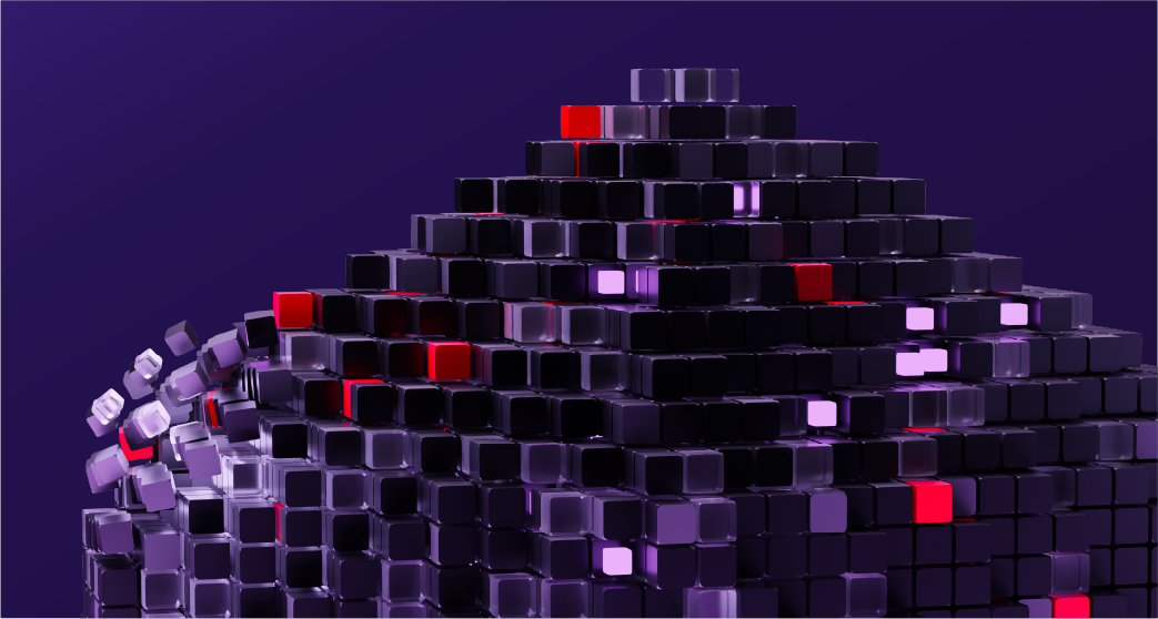
Base shapes
With all the energy and elements in collages, it’s important to ground them in their environment. With curved details that are playful and open (inspired by the details of the hat in our logo), base shapes create a frame that anchors the rest of the collage.

Base shapes can be scaled, flipped horizontally or vertically, and rotated at any increment. They can be filled with a flat color or a gentle gradient, or used as a thin stroke line.
Create balance and depth by duplicating a base shape in a composition.
Create tension by combining 2 different base shapes.

Use base shapes as windows or masks. Create openness by allowing elements to break the frame.
Don’t use shapes that aren’t part of hybrid style.
Don’t modify corner radii of base shapes. The radii were chosen to reference the hat.
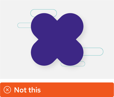
Don’t combine multiple base shapes to create a new shape.

Don’t use other shapes, like icons or illustrations, like base shapes.
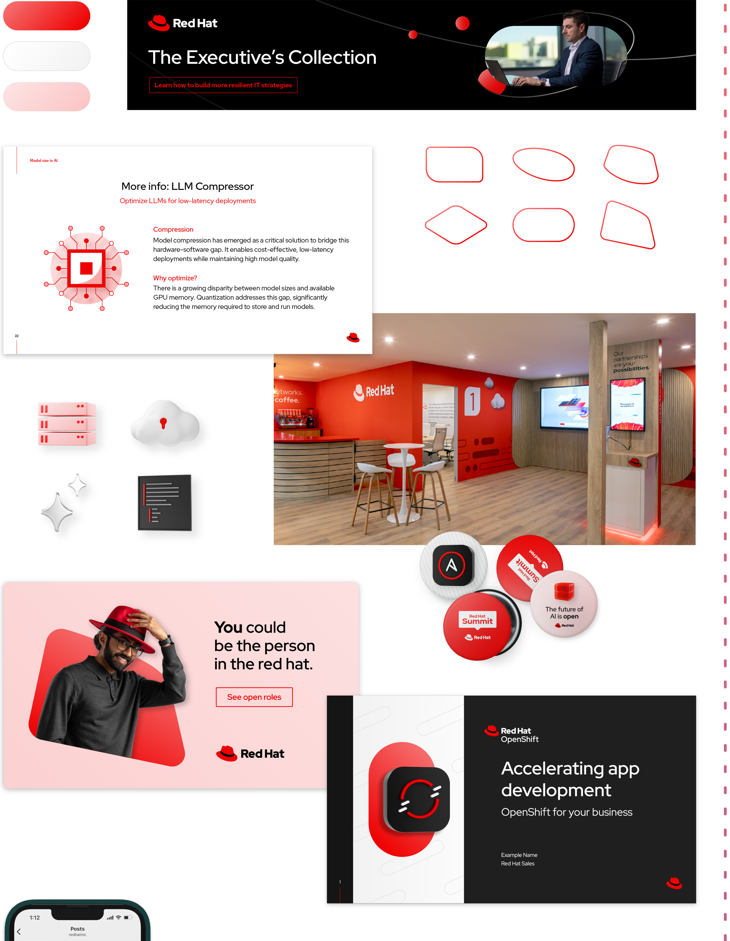
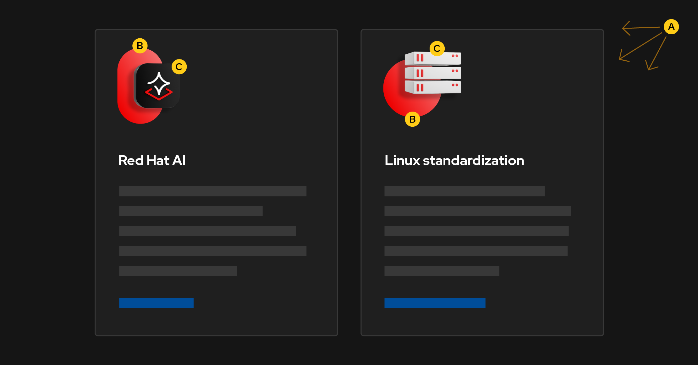
Platform artwork
Visualizing abstract technology concepts in artwork allows us to better explain what our products and solutions can do. Each category of platform art aligns with a specific Red Hat tech concept and is available in 3 colorways: dark, light, and tone-on-tone.

Linux standardization
Groups of platforms visualize how Linux provides a stable foundation for consistency across operating environments.

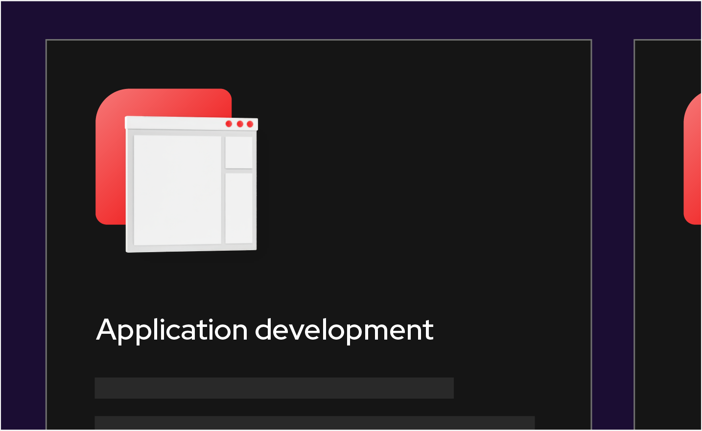
Application development
“Speed lines” visualize how we enable customers to simplify and speed up building, deploying, and managing secure apps across the hybrid cloud.

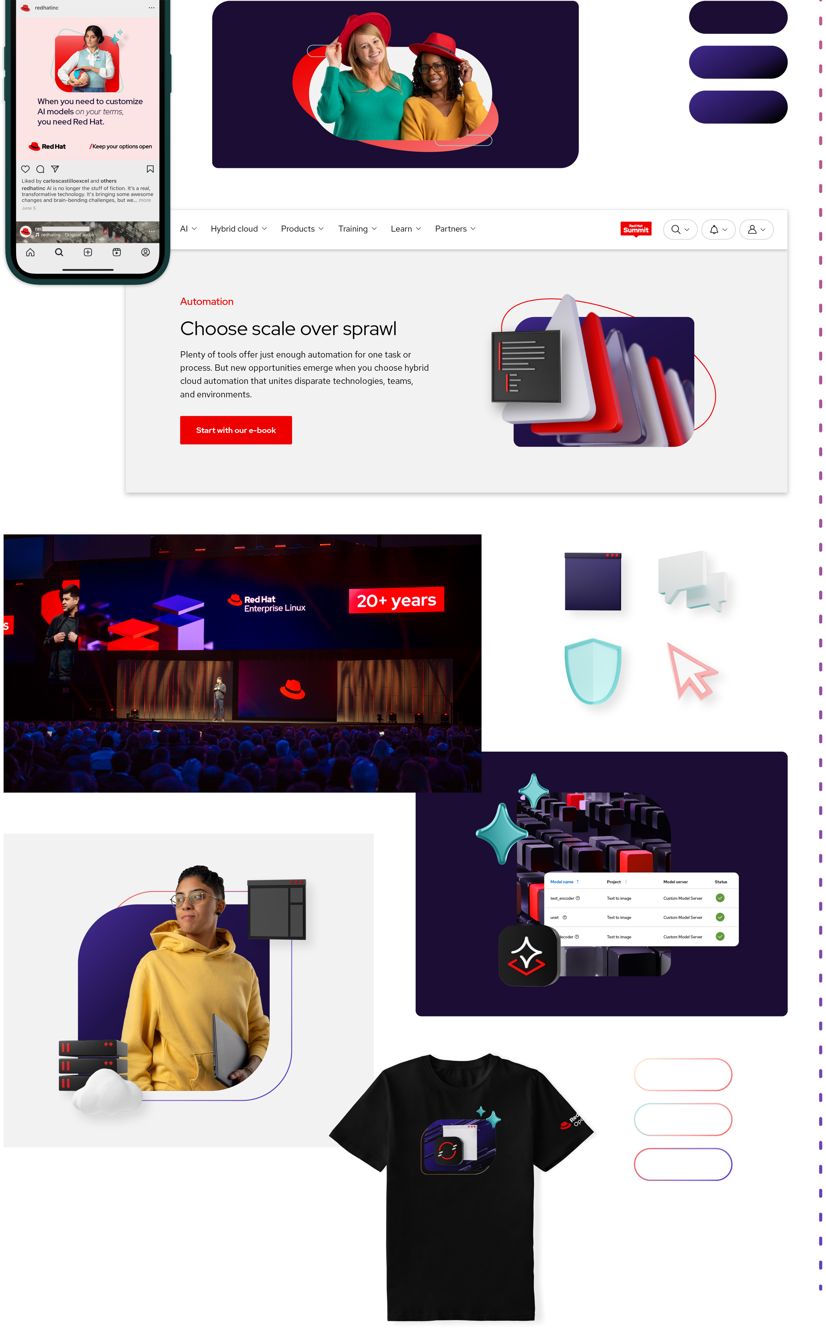
Automation
Repeating triangles visualize how automation unites tech, teams, and environments through repeatable automations that free up time.
Artificial intelligence
Building blocks visualize how smaller, modular models make using AI ready for hybrid cloud operations.
Platform art has a lot of detail and is designed to fill large spaces. The depth of field deepens the perspective of a scene, creating a sense of realistic space. They can be combined with other elements in various ways, but stick to using 1 style of platform art per composition.

Use platform art as the main background or key focal point.
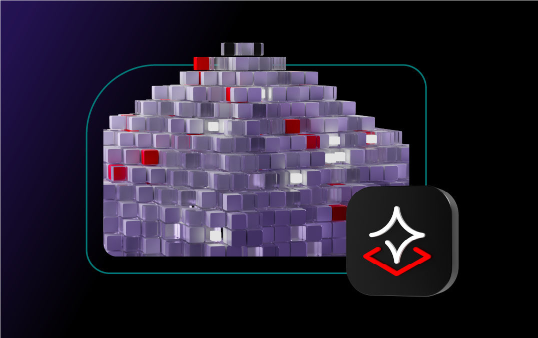
Mask platform art inside of a base shape. Experiment with allowing the texture to bleed out of the shape.
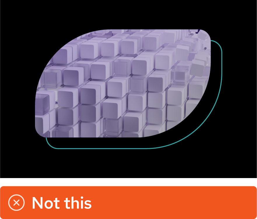
Use tone-on-tone platform art, which doesn’t include Red Hat red, for background textures.

Don’t alter the colors of platform art.
Don’t create new platform art, use art from the internet, or art generated by AI.

Don’t isolate individual pieces of platform art to use as 3D objects.
Don’t combine 2 styles of platform art or place platform art on top of a distracting background.
Story elements
Use photography, 3D objects, and 2D elements to tell the story. View our asset library to see all of the story elements available (Red Hat credentials required).
Photos
Photos of real people, places, and objects bring authenticity to our work, allowing us to create worlds that illustrate how IT professionals solve challenges. They connect to our audience’s real-life experiences, allowing them to envision themselves in our stories.
Studio portraits
Our studio portraits feature models (some of whom are Red Hatters) we selected to represent our customers, partners, and employees. We chose the poses, props, lighting, and wardrobe for each photo to match hybrid style.
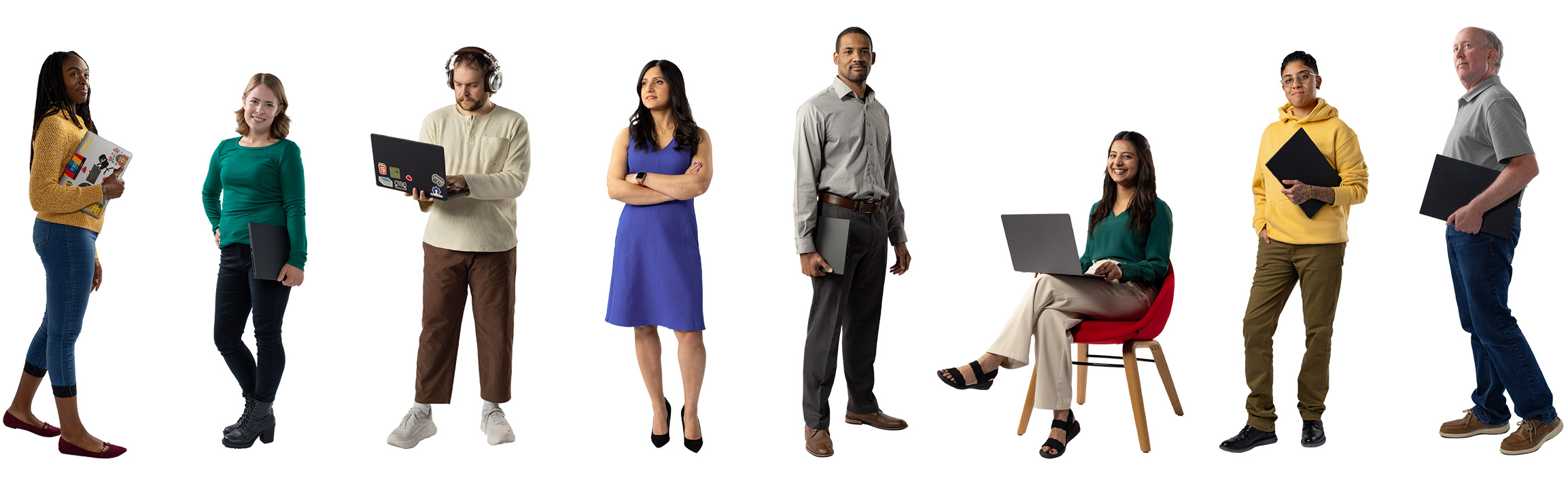
The background has been removed so they can be placed on various colors and textures. Integrate them into collages by adding realistic drop shadows and masking them inside of base shapes.
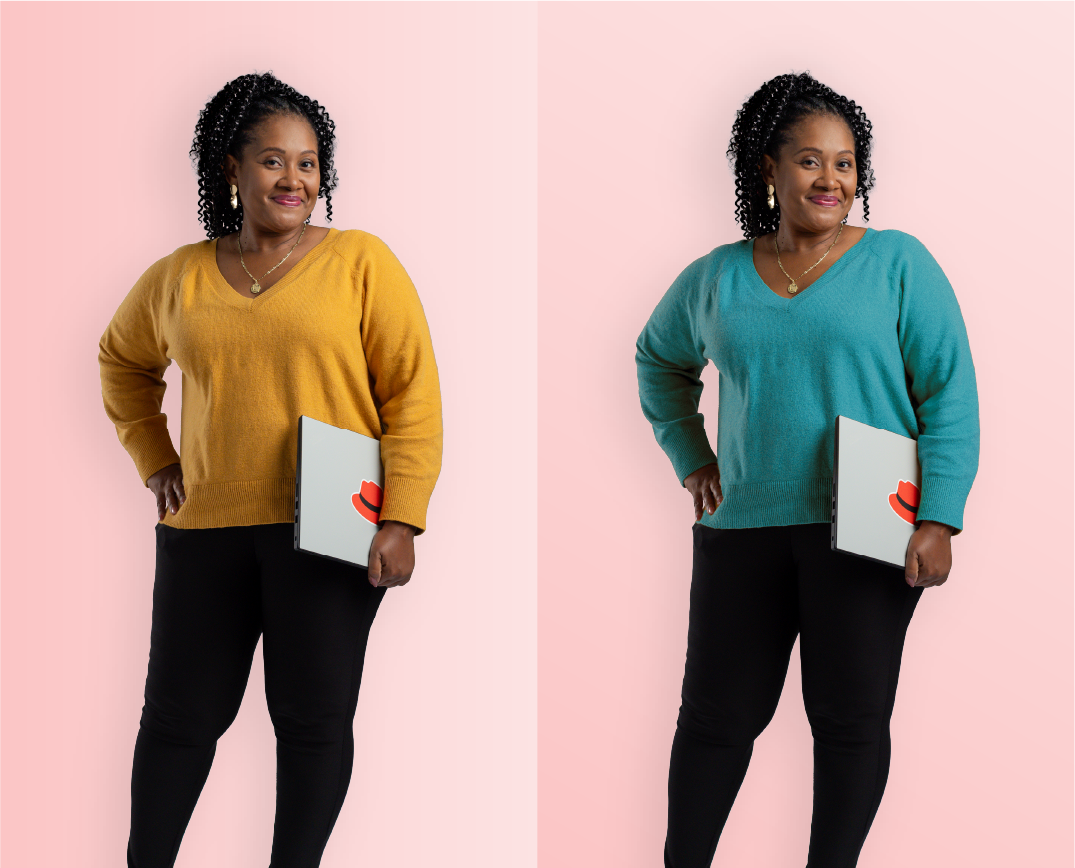
Shift wardrobe colors to match the collage if necessary, but stick to the hybrid style color palette.

Create additional depth by adding a drop shadow that matches the direction of the light in the portrait.
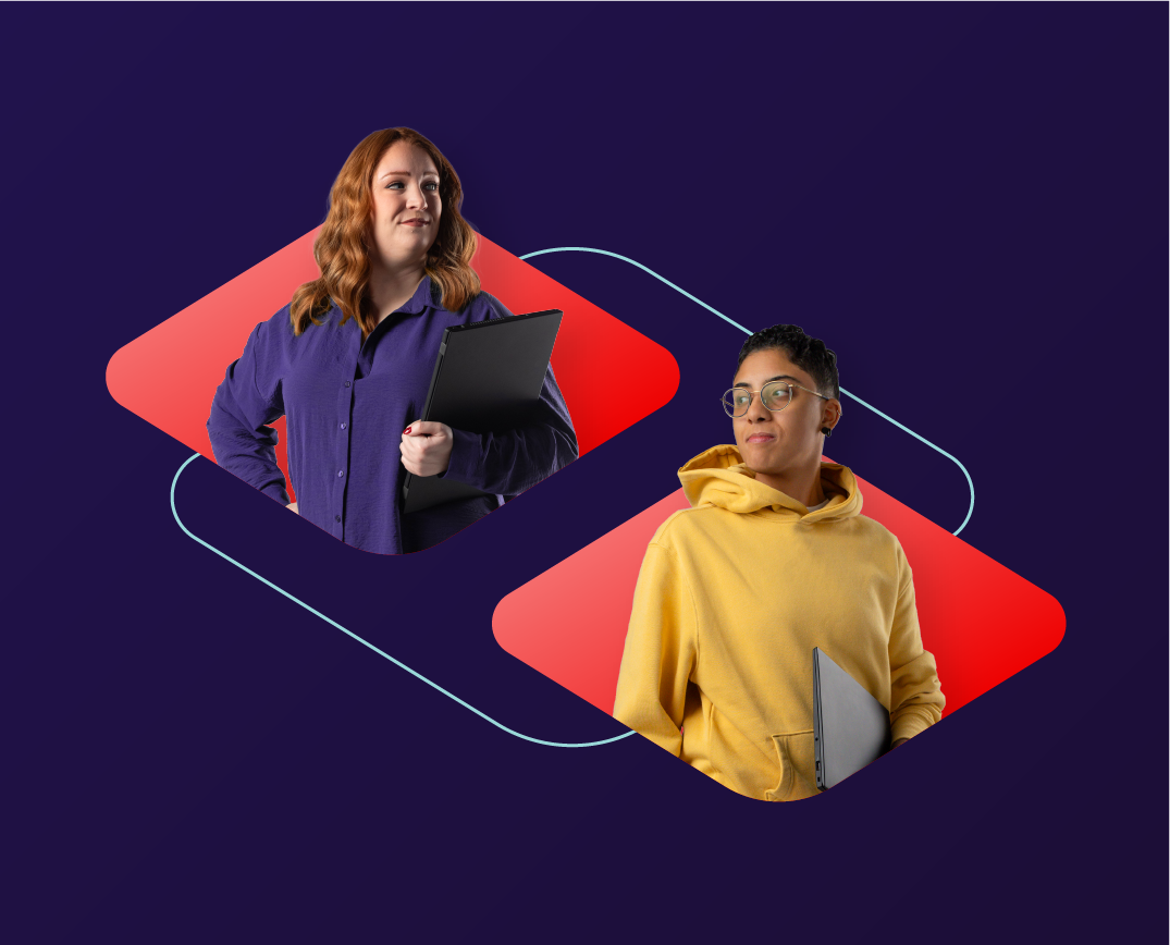
Use studio portraits independently. If there are multiple portraits in the same collage, place them in separate base shapes or separate parts of the collage.

Don’t add drop shadows that conflict with the actual lighting in a portrait.

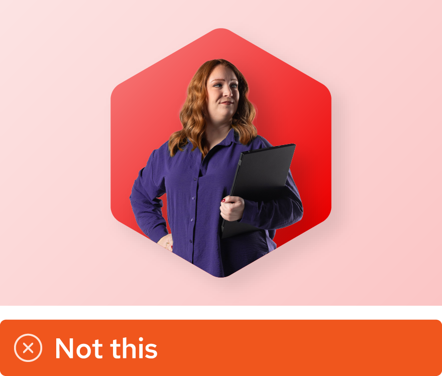
Don’t place multiple studio portraits inside the same base shape or make them appear to be overlapping or interacting.

Don’t cut people out of other photos, like candids or event photos, and use them like studio portraits.

Don’t adjust wardrobe colors to colors outside of the hybrid style color palette.
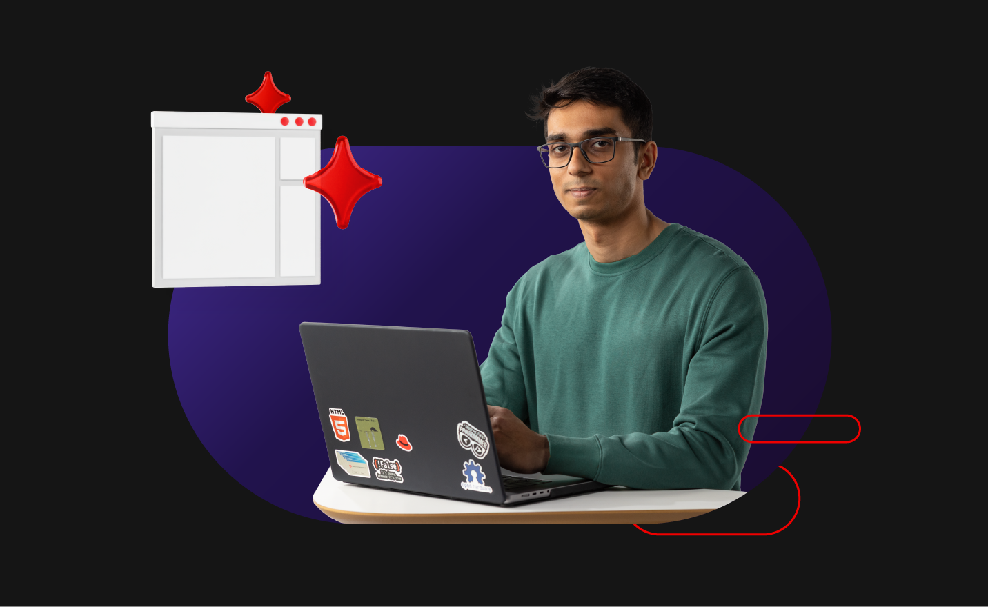
Stock photography
We have a library of stock photos, but not the stereotypical stock photos found online. We use custom stock photos commissioned by Red Hat and licensed photos carefully selected to match our brand.

Custom stock
Custom stock photos are specific to Red Hat. They focus on people—usually Red Hatters, customers, or partners (or models who accurately represent them)—and are often shot at Red Hat offices or events.

Licensed stock
Licensed stock photos are purchased from stock photo agencies. They show a concept or a place rather than focusing on people.
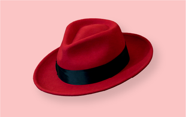
Object photos
Similar to studio portraits, we take staged and lit photos of objects—like fedoras or hardware—to use as elements in collages.

Don’t use a stock image as a full-bleed background.

Don’t use licensed stock photos that focus on a person.

Never use AI-generated images of people. Showing real people is an important part of being authentic.

Don't cut objects out of stock photos to use in collages.
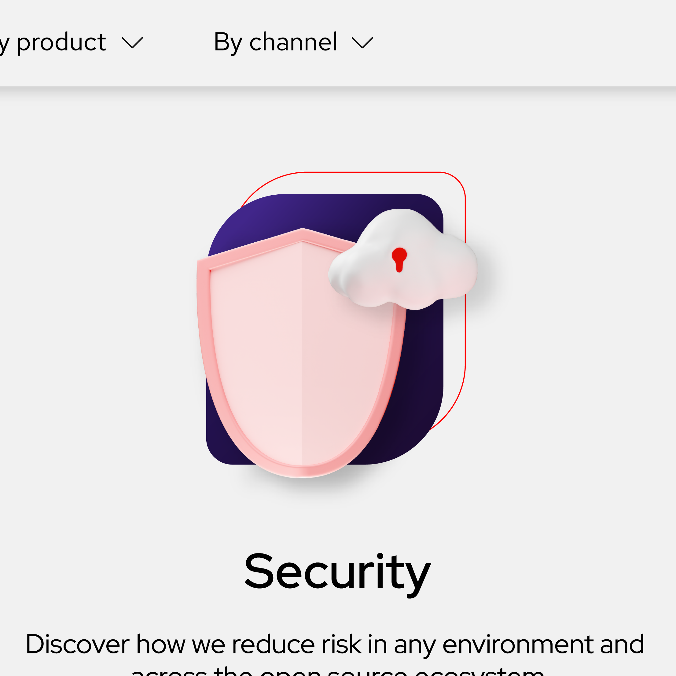
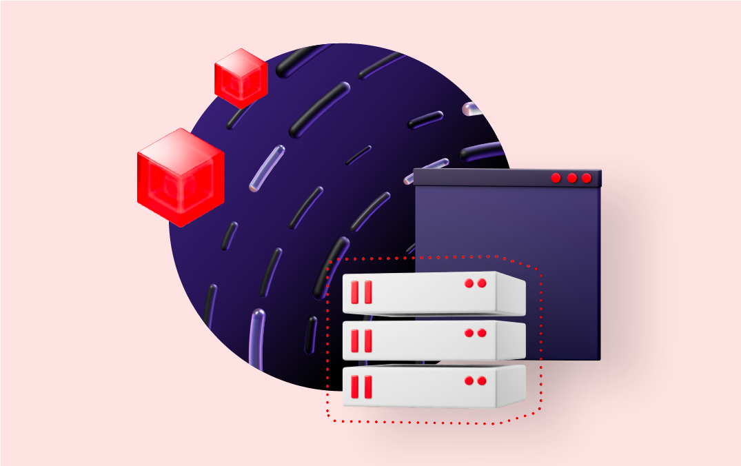
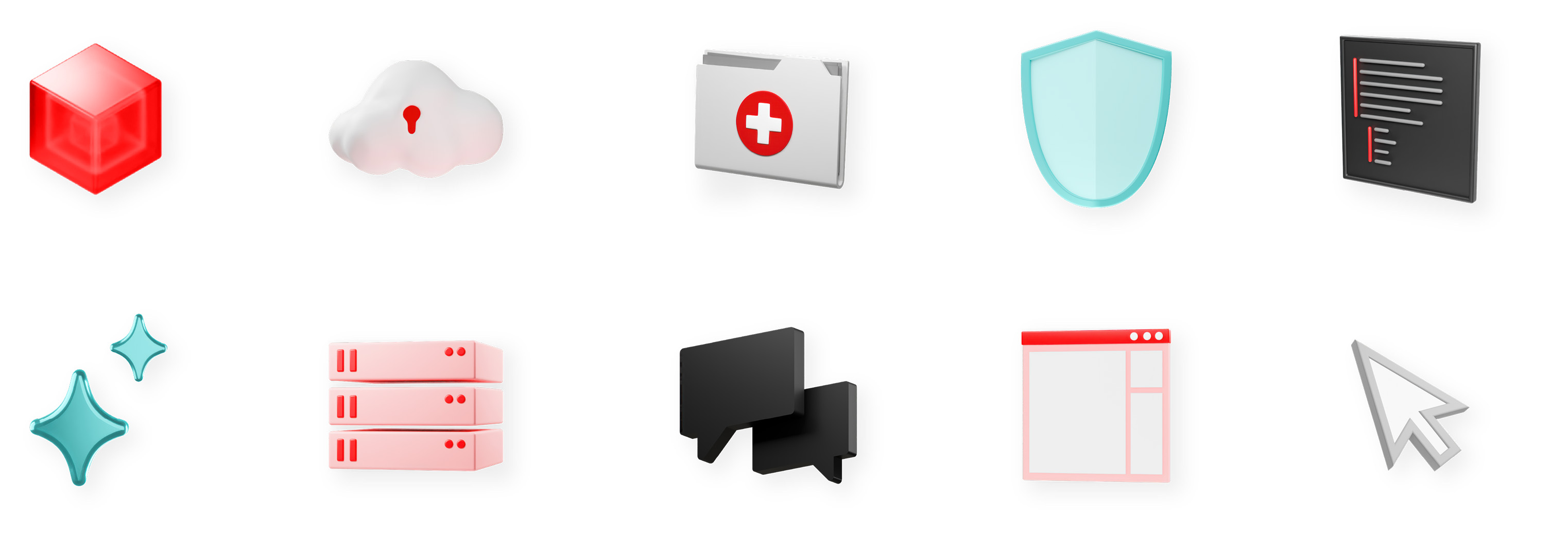
3D objects
Our 3D objects are similar to (and often based on) our icons, and visualize concepts in a stylized way that adds depth and variety to collages.
Simple objects
Many of our 3D objects are simplified, stylized representations of a specific topic. They’re usually a real-life object that relates to the technology or vertical (like a server or car). Some are metaphorical, representing the concept or the way the technology works (like a shield for security, or sparkles for AI).
Each object has been rendered in multiple colorways and from multiple perspectives. Choose the colorway and perspective that best matches the rest of the collage.
Detailed models
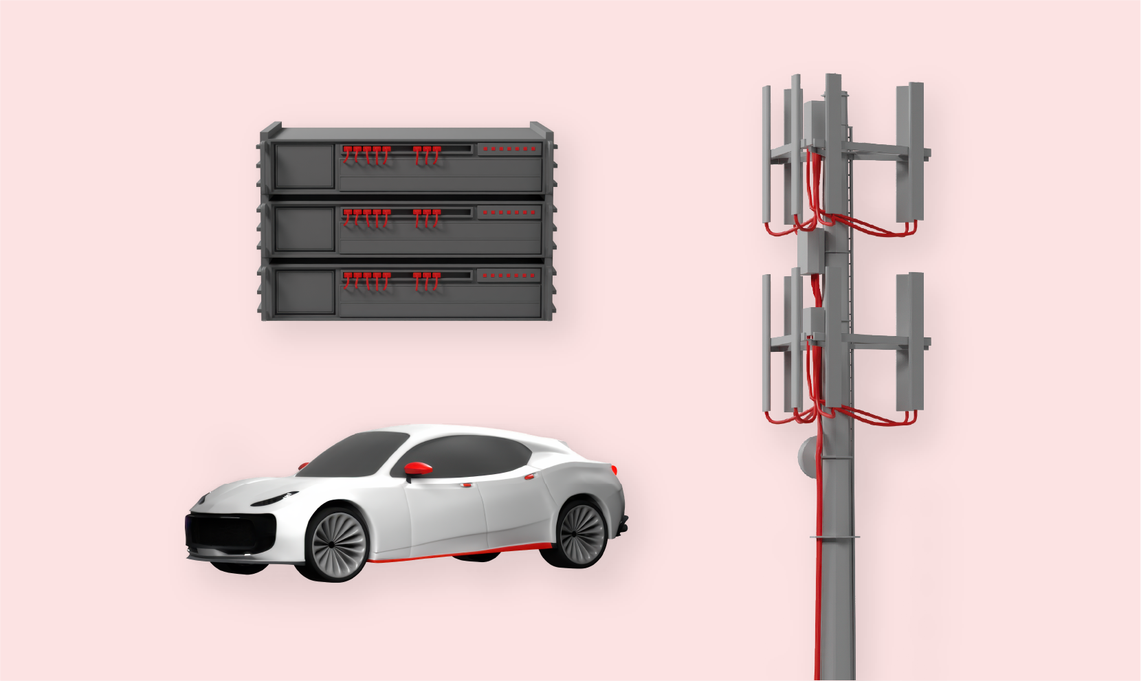
Detailed 3D models represent realistic objects more literally. These work best as the focal point of a collage when referencing verticals or technical topics.
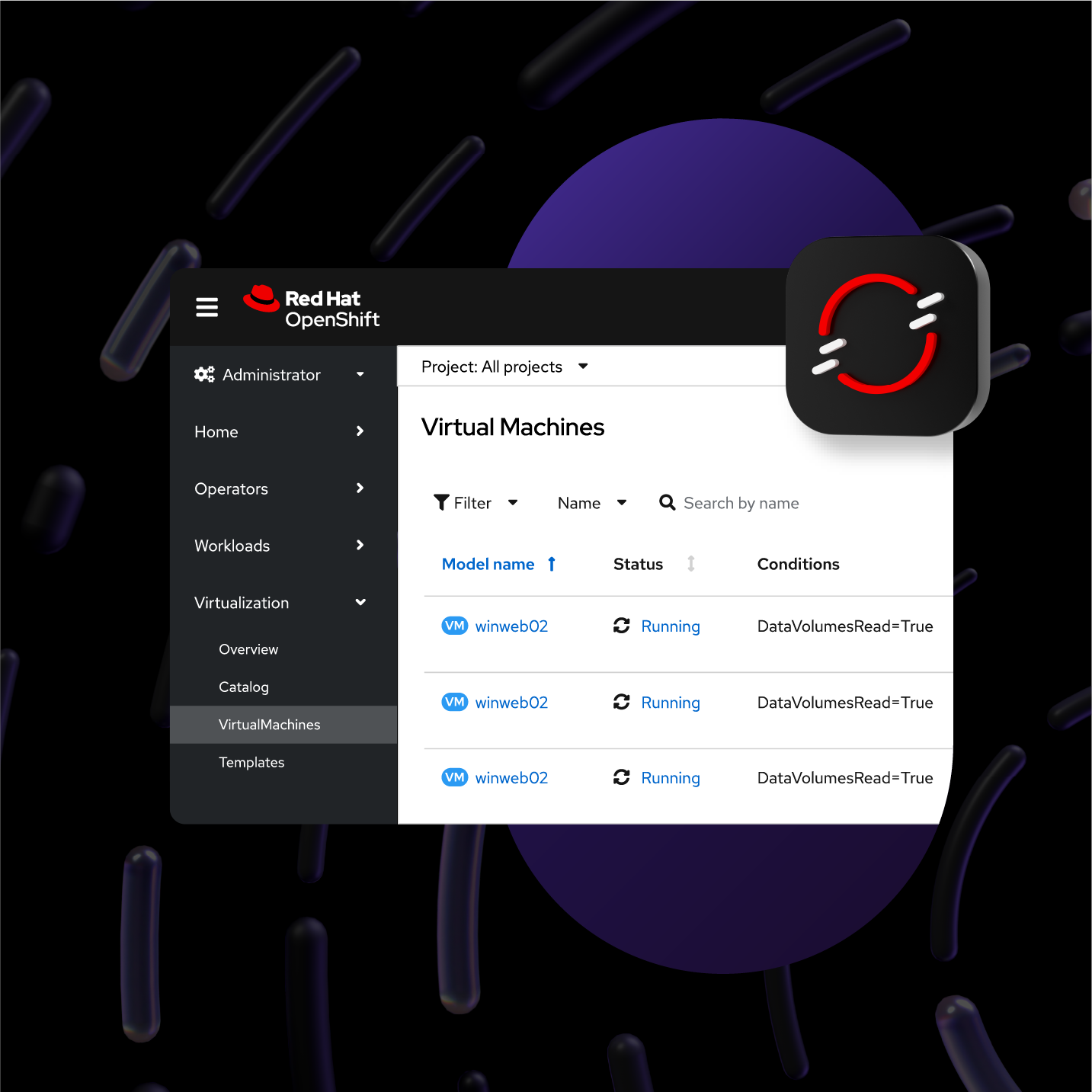
Technology icons
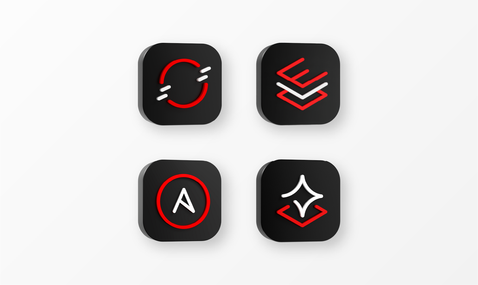
The technology icons representing our 4 platform sub-brands are available in 3D. These are the only icons available in 3D. Don’t create 3D versions of other icons (use the 2D version instead).
To create distance from other elements, add a soft drop shadow that matches the light cast on the 3D object. Adjust the settings so that the depth appears plausible.
It might be necessary to flip or rotate objects so that lighting and shadows are consistent across a composition. Make sure that the details on the object are still oriented correctly—avoid flipping or rotating objects that need to stay in a specific orientation to be understood (like technology icons or logos).
Use 1 object alone in a mini collage to represent a single concept.

Combine 2 objects to represent a more complex topic.
Balance several objects with other elements to build a story.

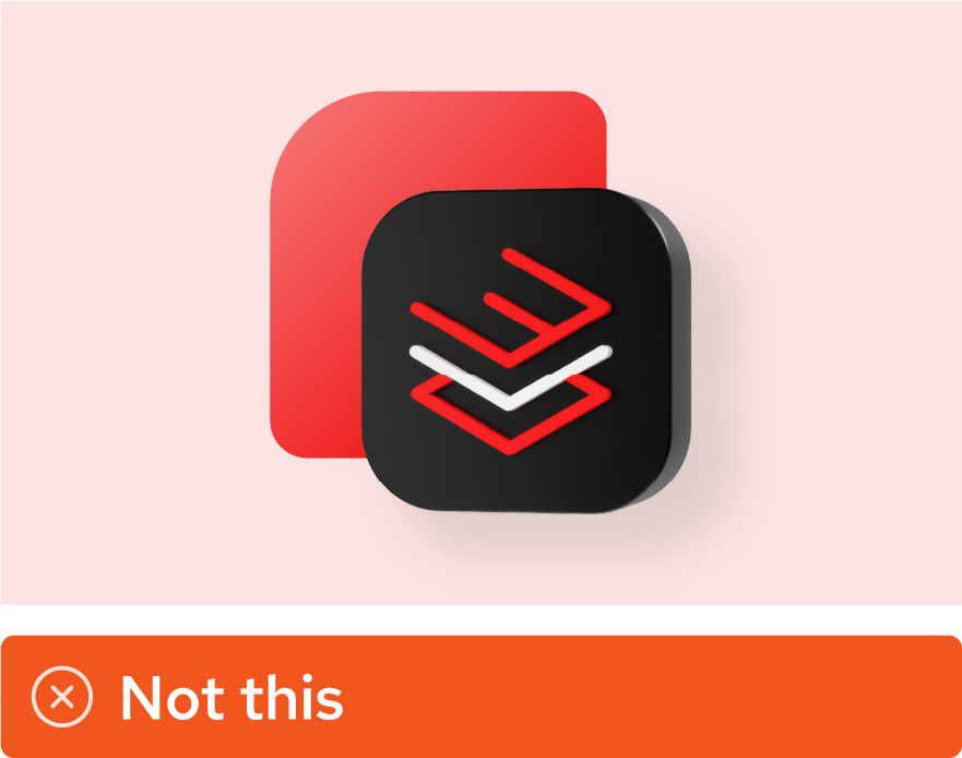
Don’t use 3D objects that aren’t in Red Hat’s style, like objects downloaded from the internet.

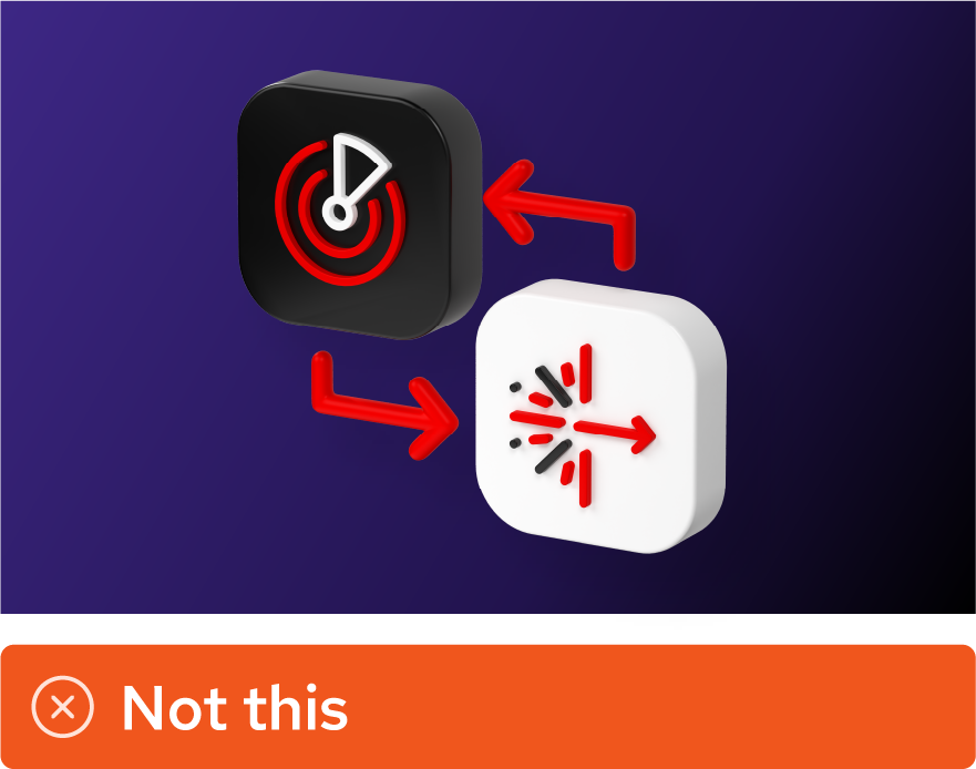
Don’t recolor 3D objects. Use them in the colorways provided.

Don’t add a drop shadow that conflicts with the lighting on the object itself.

Don’t add a drop shadow that’s too harsh. Shadows should be soft and subtle.
Don’t flip or rotate objects that need to stay in a specific orientation to be understood.
Don’t create 3D versions of technology icons for other products. Only our 4 platform sub-brands have 3D icons.
Don’t mix 3D and 2D technology icons in the same space. If one of the icons is only available in 2D, use only 2D icons.
2D assets
Sometimes 2D assets are the best way to incorporate an idea or concept. We’ve built an extensive library of 2D assets like icons, illustrations, and logos in the Red Hat brand style. Partner and customer logos and visualizations of product interfaces also work best in 2D.
The hybrid style allows for a mix of 2D and 3D elements, and both can be combined into collages in different ways.
Icons
Standard icons have small details that can get lost. Add a backing shape behind them to distinguish them from the rest of the collage. Make sure that the icon has enough breathing and sufficient contrast against the color of the backing shape.
Logos

Maintaining the integrity of our logos and the logos of customers and partners is important. Like icons, place them on a backing shape and use them respectfully with appropriate clear space and sufficient contrast.

Don’t apply drop shadows or effects to icons or logos themselves. Place them on a backing shape.
Don’t make an icon or logo feel too crowded inside of a backing shape. Let them breathe.

Don’t recolor logos. Use them as provided.

Don’t create 3D versions of icons or logos.
Illustration
Mini illustrations
Place mini illustrations onto a base shape and add a drop shadow to create a mini collage.

People illustrations
Use people illustrations like studio portraits: mask them inside of base shapes and add drop shadows to integrate them into a collage. Adjust their wardrobe to accent colors from the hybrid style palette when necessary.
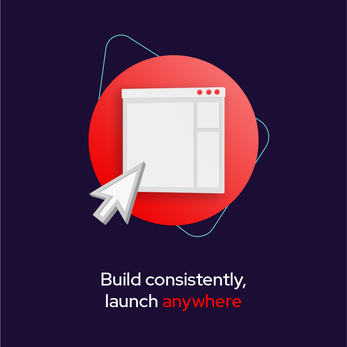
Product visualizations
Incorporate product interfaces into collages with varying levels of detail. Interfaces have a lot of details, so they should be a main focus of the collage.

Don’t combine a mini illustration into a complex collage. Use a single mini on a single base shape.

Don’t recolor minis.
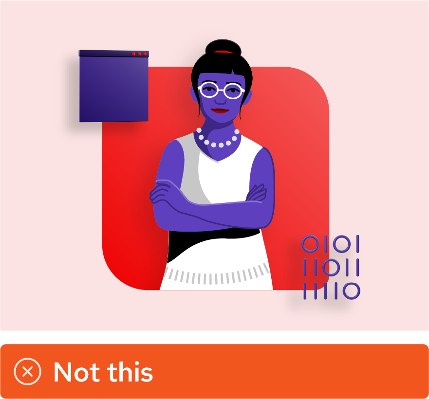
Don’t change the skin tone of illustrated people to make them match hybrid style (no purple people, please).
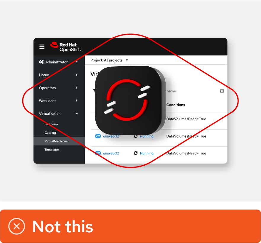
Don’t use product visualizations as a background element; they should be the key focal point of the collage.
More
Download elements
Download elements from the Red Hat brand portal (Red Hat credentials required).
Access design files
Learn how to access design files and more (Red Hat associates only).
Creating collages
Bringing multiple elements together into collages is key to telling stories in the hybrid style. The possibilities for creating collages are endless, but to create a consistent feel across the Red Hat brand we need to keep a few principles—rooted in our brand platform and personality—in mind for every collage we create.
Make it open
Keep it focused
Mix it up
Give it depth
Anatomy of a collage
Each collage should start with a single, clear concept. Include the elements necessary to tell the story and only those elements.
Required elements
A. Single light source
B. Grounding elements
C. Focal point
Context-dependent elements
D. Additional story-building elements
E. Accent shapes

Web cards are narrow and appear near other web components. These mini collages use only the required elements—a single focal point contrasted against a base shape, all in our core colors—to add dimension and visual interest without unnecessary clutter.
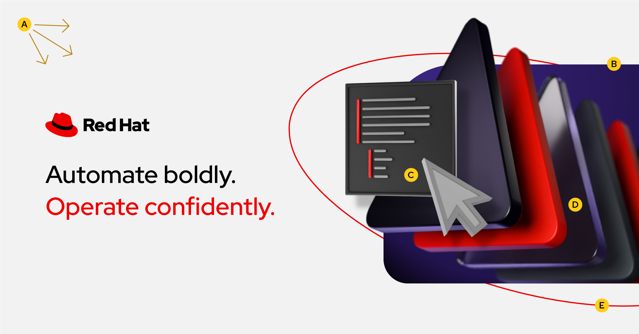
Ads capture attention and invite the viewer to learn more. This collage uses expressive elements like accent colors, platform art, and an accent shape to create a dynamic image showing that Red Hat has powerful, modern automation software.
Applying the principles
Make it open
Create compositions that have ample white space and a clear hierarchy that balances the minimum elements needed to tell the story.

Use white space to put a focus on the collage. Keep the number of elements to the minimum amount needed to tell the story.

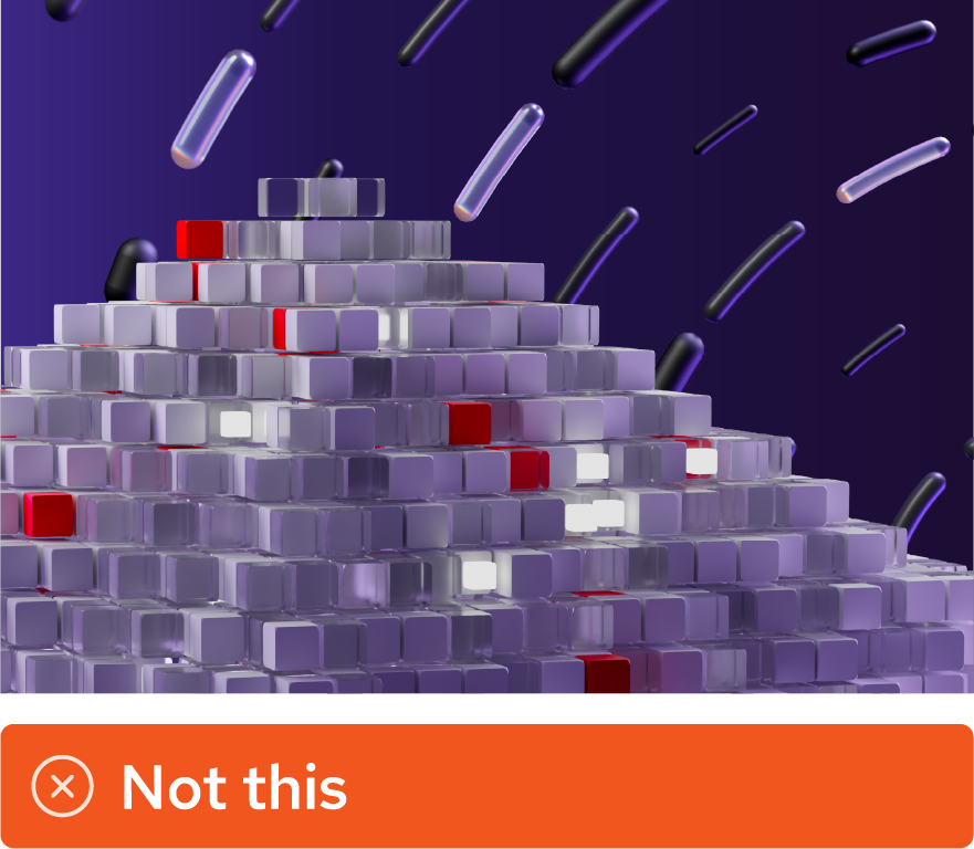
Pay attention to the number of elements in a composition. This collage is beginning to feel too busy.

Don’t add extraneous elements that aren’t adding to the story.
Keep it focused
Create balanced, interesting compositions that have a clear focal point.

Create visual balance to draw the eye towards the focal point. Emphasize the focal point by creating contrast between the foreground and background. Use Red Hat red in every collage.

Be careful of not establishing a clear focal point. While the placement of elements on a composition may suggest a focal point, the scale or color of elements may suggest another.

Don’t use elements that do not contrast enough with one another, or detract from having a focused concept overall. Don’t forget to include Red Hat red.
Mix it up
Create compositions that are hybrid—combining photography, 2D assets, and 3D objects—while staying cohesive and balanced.

The purpose of hybrid style is to mix mediums. Create collages that combine photography, 2D assets, and 3D objects.

Be careful of mixing elements in a way that is distracting. This collage has a mix of elements, but it's difficult to know where to look first.

Don’t create a collage that relies heavily on one medium when other elements could aid in storytelling. A base shape could help ground the collage, or a vector line could create movement.
Give it depth
Choose a single source of light and use highlights, shadows, and layered elements to create visual depth and dimension.

Choose a single source of light. If the collage has a photo, use the light source from the photo.
Use masks and drop shadows to create dimension and show that elements are interwoven with each other.

Be careful of making collages that feel too flat. While the light source is consistent, there are no drop shadows or vector lines to aid in showing how the elements interact with one another.

Don’t create collages that fall flat. Avoid mixing conflicting light sources or mask elements in a way that feels awkward.
More
Download elements
Download elements from the Red Hat brand portal (Red Hat credentials required).
Download collages
Download existing collages from the Red Hat brand portal (Red Hat credentials required).